I know, it is a lame title, but couldn’t find another more suitable one for this review.
On my last post, I posted a little, short review of the Windows 8 Release Preview, and the hard time I had with some of its "features”. Well, looks like some of those features are here to stay much for some of us veteran users’ dismay, such as the new, confusinguser friendly MetroModern UI Start menu. Ugh, I still have a hard time trying to navigate through that thing! But well, point is, I’ve finally got my hands on the final version. Given most features remain unchanged since the RP version, we’ll not bother re-reviewing, but writing an opinion about…
Or, should I say…
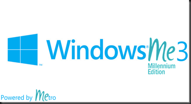
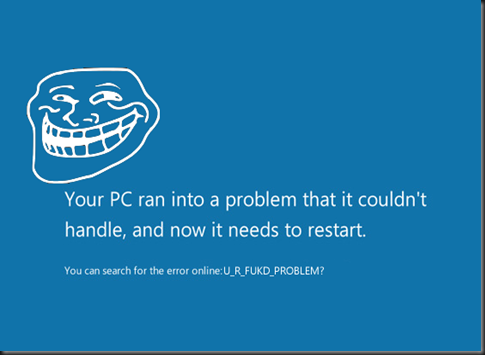
All right, where should we start? Okay, first stuff’s first. Sadly, I haven’t got ant screenshots of it, but I managed to upgrade to the RTM version without losing any settings or programs by using a little, nice trick. Surprisingly to me, the process was damn straightforward, and even the error I had to dealt with in the RP (picture below) is no more. Microsoft did something good, but still, the OS is awful, at least for desktop users.
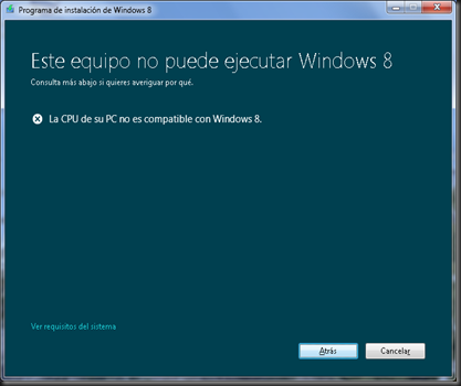
Remember this troll? This error is NO MORE in the Final release of Windows 8. Woohoo?
I had to deal with a few other stuff right after the final release was installed. Oh the irony…
As mentioned before, I prefer the old Windows Vista/7 Boot manager, instead of the more confusing graphical-styled one that comes by default under Windows ME-3. Nothing has changed. Still the same unesthetic bootscreen, with the same tedious procedure when you start another OS than Windows ME-3. Good thing is, you can use BCDEDIT.EXE to revert it to the old, faster text-mode one.
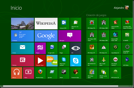
After a couple hours, tweaks and such, and going through a little tutorial (for touchscreens) on how to use Windows ME-3, I’m presented with my migrated user account, and upon logging in, with the already familiar, dreadful, confusing, mind-raping, “pull my hair out of desperation”-triggering Start screen:
Given it was an upgrade from the RP, all of my apps were still there. As you can see I decided to install some more shit as well, given the broader repertory in the RTM’s Windows Store. Some of the games include the classics: Minesweeper, Solitaire and other stuff. Some of the apps are nice freebies, but still, the Metro interface (now called “Modern UI”, “Windows 8 Style”, or as I call it “Shitty UI”) feels like quite a stepback. Like I mentioned before, it is like going back to Windows 3.x’s single-tasking days, with a much…blander look. Win+Tab key still works to switch between the apps, and surprisingly, Alt+F4 closes them, so I can save all the crazy gesturing shit I had to do in the RP (the hotkeys did not work for me at least in the RP).
Tried some other Shitty UI apps, such as Skype or IM+, and to my own dismay, the connectivity was stable… Yes… as stable as enrichened uranium. I kept being asked if I had connection problems and shit, but I doubt it is my connection or something, since the desktop version for Skype and Pidgin’s connectivity still worked like a charm (Edit: I just found out that is not actually a bug, but another shitty feature designed to "save power/CPU usage or stuff"). Plus, the Skype app would keep connecting without me noticing upon logging into my account. Haven’t found a way to stop it from doing so yet.
The Start screen… what can I say about it? It is so bloody hard to find stuff like the Control Panel (which I tend to access from My Computer, on the Ribbon), unless you use the Search feature. Microsoft, you’re doing it wrong. You’re doing it ALL wrong!
The desktop still looks –almost- the same, except for the now flat-looking, unappalling theme it has by default. Like I mentioned in the RP, the transparency of Aero Glass was removed (except for the taskbar) in favour of this:
Microsoft has dropped Aero completely, just because they told it was “old and cheesy”. Well, the flassy look in Windows Vista looked more modern than this thing, and it got improved in Windows 7. Man, I got so delighted when I first tried Windows 7, even since the RC, unlike Windows ME-3. Now, if you want something cheesy, well, you have the new cutting-edge, state of the art Windows ME-3 Theme.
Now, by testinf the classic desktop apps, most of them seem to work just fine, for now, but they tend to act up at times as well. For example: Skype itself. IT FUCKING FREEZES RANDOMLY. On the bright side, the new Task Manager comes in handy to kill the program without questioning anything.
Moving on from the software itself, here comes the ironic facts.
You might be asking… Why have I dubbed Windows 8 as “Windows ME-3”? Well, Windows Vista was the Windows ME-2, and Windows ME-3 is already being a failure. Analysts are already foreseeing Windows ME-3 as another disaster for Microsoft, making it comparable to Microsoft Bob. I’ve watched some of MS’s ads about Windows ME-3, in Mexican Spanish as well as in English, boasting the OS’s “user-friendly” interface. Now, I want you to do a little experiment to prove you how easy it is to use Windows ME-3:
Easy to use? Yeah, right… We’ll see about that!
You’re gonna need:
- A computer with Windows 8 installed
- Another computer (or a hard drive partition/virtual machine) with a previous Windows version. It could be from Windows 95 to Windows 7.
- A user, preferrably familiar with Windows 7 or earlier, that hasn’t tried Windows 8 yet.
- Mouse and keyboard or… *cough* even a tablet.
- A camera would be preferred, but it is not required.
Once he succeeds, ask him to do the same, but under Windows ME-3. Given you have some experience with the OS, you can explain them later the Shutdown is in the Charms menu, given they’ve gone all nuts pulling the hell out of their hair realizing the Start menu was no more or the Shutdown option was that hidden. Don’t forget to give him/her a prize for their patience! 
So yeah, here’s your user-friendly Windows ME-3.
Now, it is ironic. Microsoft has spent already billions of dollars in promoting their new OS hoping it would succeed as much as its predecessor. And their sales are way below those of Windows 7 at the same time after release.
The system has got mixed reviews already (yes, there are already Windows ME-3 fanboys bitching at how awesome the UI is), so don’t expect Windows ME-3 to sell as much, or especially outnumber Windows 7’s sales. You can say whatever you want, but this will be another failure in Microsoft’s history.
It is so their desperation that they are already giving pirates a chance to upgrade to a legitimate Windows 8 copy, Media Center and all. HOW IRONIC! 
So, what’s my opinion? Don’t upgrade to Windows ME-3. Stay with Windows 7. I advise not to stay with XP anymore, since it is now about to die, much to our dismay. If you’re too curious to experience Windows ME-3 yourself, do it on a VHD (Windows 7 Professional and up has this feature), a Virtual Machine (I recommend VirtualBox or VMWare Player. Don’t recommend Windows 7’s Virtual PC much for this OS), or in another partition. If you upgrade your Windows XP/Vista/7, you’ll so regret it later. Oh Microsoft, what have you done? You’re still on time to mend your ways, before Windows ME-3 spells from just “FAIL” to “BANKRUPTCY”. Listen to what your customers want. If we want the Start menu back, bring it back! IMHO, it was a terrible idea to merge two platforms (Desktop and Tablet) in one.
EDIT: Here's a little something I mashed up on a single bloody night:
EDIT: Here's a little something I mashed up on a single bloody night:
