Tuesday, December 18, 2012

21.12.2012

Well, we are just a couple days away from the so feared day, December 21, 2012, when people claims will be the End of the World™, the Judgement Day™ and so on goes the list. It has come to my attention, that lately, cause of that, Southeast Mexico (mostly the worldwide famous Chichén Itzá ruins) has become quite a hotspot for people all around the world.

December 21 is the day where the long-cycle calendar starts over, that is, a new Bak’tun, the Bak’tun 13, will start. And some people takes the chance to spread apocalyptic BULLSHIT over the internet in order to create panic (and generate great PROFITS especially in Southeastern Mexico).

I’ve heard lots of “theories” about what people thinks will happen:

444_awesome_earth_asteroid

The Mayans foretold it: the end will be AWESOME!!!

1. Nibiru: The so-called, unexistent Planet X aka “Nibiru” will come close to the earth, and thus will bring chaos and devastation to our planet.

2. Hercolubus: Same shit as Nibiru, except this planet is supposed to be bigger than the Earth.

3. Annunakis or “reptilians” taking over the world. Come on, are you that STUPID?

4. The one I’ve heard of recently, according to some Catholic prophecy and a Japanese “princess” as well: three days of darkness. Whether is caused by a solar flare, or comet, or the Solar system passing through a dense part of the galaxy, or planetary alignment causing the Earth not to receive any sunlight for 3 years. Also, electrical network is said to be crippled too. And tons of deaths, earthquakes, and all the horrible shit typical of an apocalypse.

5. The poles melting, and thus sinking most of the landforms we know nowadays.

6. The poles inverting.

All I have to say is…

COME ON!!!

ARE YOU THAT STUPID?
REALLY?

None of this bullshit is going to happen, so CALM DOWN. Don’t let your IQ fall by who-knows-how-many-points over something so trivial.

It is just the beginning of another period according to the Long Mayan Calendar. A Bak’tun is a unit composed of 20 Ka’tuns, which are composed by 20 tuns themselves. A “tun” is the Mayan year, which is based on the lunar phases, I think. It works the same way as our Gregorian calendar, where we have millennia, centuries, decades, and so on.

My opinion? Like Squirtle said once…

GO READ A BOOK OR SOMETHING!!!!

Wednesday, December 12, 2012

Coping with Windows 8’s usability: Start Menu

windows-ME3-logo
How do I start?
I recently got an Acer Aspire One 756 netbook, and I must say I love the computer. It is nice, slim, elegant, it it was quite a nice choice. A pretty good performance for a netbook. But I had a problem with it: Windows 8 aka Windows ME 3.
Despite being familiarized with the latest OS from Microsoft, which boots on my desktop besides Windows XP through 7, I had quite a hard time the first times I tried to handle Windows 8 on my new computer, ironically. As far as I know, this model was originally powered by Windows 7 Home Premium (another highlight, since most netbooks had Windows Starter), and they decided at some point begin shipping them with ME 3. And thus, mine came pre-loaded with Windows 8. Now, I’m not willing to wipe out the HDD and install 7 from scratch, as it would involve turning UEFI off, and looking up for the OEM shit from Acer’s website, which would take me quite some time. I felt like pulling my hair, since Windows 8, if hard to use with keyboard and mouse, was a harder experience using a touchpad.
Okay, so you’ve probably read my two previous short critics regarding Windows 8, Release Preview and RTM versions respectively. Microsoft would not hear its customers, and thus, decided to keep their latest OS hard to use for newbies and us veterans alike. Basic functions such as Shutdown have been hidden, given the Start menu is no more, and it takes a good while to discover the “Charms” menu and how to summon it (where the Shutdown is found now).
The lack of the Start menu is one of the things I bemoan the most about this OS, plus the “Modern-UI” apps, which make me feel like going back in time to Windows 3.11’s single-tasking days. So, now we will be examining a few options to cope with this loss, until Microsoft realizes their mistake and bring the Start menu back in. That is, if they ever get into reason and decide to do so…
Coming up next, I will present some of the most popular programs and tweaks out there, and what I personally think of them. Some of them might help making Windows 8 a bit easier to handle while others… hahaha…

1. Create a “Start Menu” Toolbar

Instructions copy-pasted from How-To-Geek:
It’s not a well-known feature, but Windows can create toolbars that show the contents of a folder on its taskbar. This means that you can create a pseudo-Start menu without installing any other software on Windows 8. Just create a new toolbar that points at the Start menu’s Programs folder.
From the desktop, right-click the taskbar, point to Toolbars and select “New toolbar.”
Type or copy and paste the following path into the Choose a folder window:
%ProgramData%\Microsoft\Windows\Start Menu\Programs
Click the “Select Folder” button and you’ll get a Programs menu on your taskbar.
Laaaaame…
Right-click the taskbar and uncheck “Lock the taskbar” if you want to move the new Programs menu around.
Drag and drop the grip at the left side of the toolbar to place it somewhere else on the taskbar, like at its left side — the Start menu’s traditional location.
This workaround is even more stupid than Windows 8’s start screen.
Right-click the “Programs” text if you want to change or hide its name. After you’re finished, right-click the taskbar again and select “Lock the taskbar.”
There’s one catch with this method — it won’t actually show all your programs. The Start menu actually grabs shortcuts from two different places. In addition to the system-wide ProgramData location, there’s a per-user Programs folder at the following location:
            %AppData%\Microsoft\Windows\Start Menu\Programs
As you can see from the screenshots, the Windows Defender shortcut — and other shortcuts — don’t appear in our toolbar menu.
You could create a second toolbar to list programs from this folder, or perhaps move shortcuts from the %AppData% location to the %ProgramData% location.
Another option is creating a custom folder full of program shortcuts and using a toolbar that points at that folder instead.
Do I recommend it? No
Pros: None.
Cons: This method is not even a Start menu. While these kinds of toolbars might be useful in some cases (ie, bringing back the Quick Launch for those who prefer it, or another custom launch toolbar) it is about the stupidest workaround I’ve ever seen. I find it as useful as getting to use a 5.25 inch floppy disk on a modern computer. And note that I highlighted… “it won’t actually show all your programs”. That’s right. If you want to access all of your Start menu items, you’d have to either move everything into a folder (since Start menu uses two, a system-wide and a per-user folder) or creating two damn toolbars. Whoever thought of this, should be impaled. Ugh…


2. LeeSoft’s ViStart

“ViStart” is a pun on “Windows Vista” and “Start”, and likely it would mean “Vista’s Start menu”.
image
As we can see, this looks more like a Windows 7’s start menu, unlike the first method we showed. Since I reviewed it on Windows 8 RP (where it would break the taskbar), it has got a few improvements. But meh.
Do I recommend it? No
Pros: It is a decent implementation of the Windows start menu.
Cons: It cannot be customized, besides the ability to turn “Metro” on/off. Every time it starts, it shows a splash screen and a systray icon, which gets to be annoying especially if you set it to start upon computer startup. The Start orb comes cut off. Also, it comes with potential adware and unwanted toolbars bundled.

3. Classic Shell/Win8 StartButton

Here’s an open-source implementation of the Start menu, which has more customization options. It can emulate a Classic Windows 9x, XP, Vista or 7-like menu, but sadly, it is not as accurate.
image
image
image
Now what about Win8 StartButton? It’s the same software, nothing new or relevant. Just a rebranded fork of Classic Shell.
Do I recommend it? Maybe
Pros: It is open-source (or so I take it as the downloads are from SourceForge). It is way more customizable than ViStart, giving you the ability to configure from the Start items, to the menu’s look itself, including skin, button, etc…
Cons: If you are looking for a Start menu that looks as accurate even as Windows 9x, forget about Classic Shell, as this is not the software for you. That’s why Classic Shell does not appeal to me in the slightest.

4. Start Menu 7 (aka StartMenuX)

Well, one picture is worth more than 1,000 words…
image
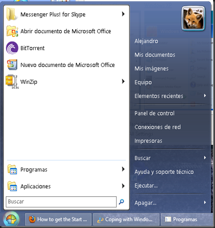
This was one of the strangest implementations I’ve seen. It has a neat appearance and all, but again, not something that appealed me that much. I actually found it hard to navigate through it. Folders don’t open submenus. Instead, they open an Explorer window. At least, it happened that way with me. Also, what’s with the strange language? That’s not even Spanish.
Like the author said…
Welcome to Start Menu 7 - the best software to replace the standard Windows Start Menu ever made. Before creating Start Menu 7 program, I've spent a lot of time to understand how a human brain works with visual information. That's why Start Menu 7 is so easy and natural to use for everybody.
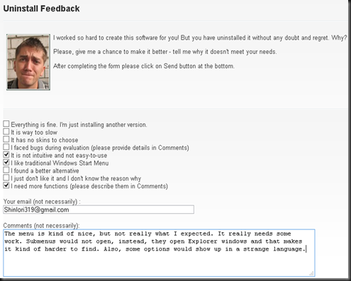
Well, the idea is nice and clever, but it still needs lots of work to have at least half the functionality a traditional Start menu has. Also, upon uninstalling it, my browser opened with the following website:
image
Haha, I am pretty sure the text and the picture of the creator with puppy eyes is intended to create remorse on whoever uninstalls his software. But yeah, I sent my feedback. Hopefully the author will not drop it into a broken sack like some companies do with their customers. But for now, I don’t recommend using it. So…
Do I recommend it? No.
Pros: Well, it’s…different
Cons: No submenus implemented, also looks like there’s a “Pro” version. I don’t know what it has, but still. If you’re using a non-English version, it will likely show some options in a strange European language.

5. Pokki

Another strange implementation with its own apps as well. What can I say?

Do I recommend it? Maybe
Pros: It comes with an elegant look, plus it has its own apps and stuff, which you can get from the Pokki App Store.
Cons: Again, if you want an accurate Start menu, this is not the software for you.

6. Stardock’s Start8

Well, last, but not least. This was one of the programs I examined back in the Release preview, by then avoiding since it had only a miniature Metro start menu. The final version has more than just that. Just take a look by yourself.
Okay, that looks more like a Start menu I’d love to use. Actually, Stardock has done quite a good job, and honestly this is the best implementation out there. Even the button itself, it looks as I think it would look of MS still thought rationally. One downside I found was upon trying to use it under Aero Lite, which would actually trigger the transparency glitch on the taskbar (“Aero Broken” or “Aero Glitch”).
image
Do I recommend it? Yes
Pros: It is the most accurate implementation of the Windows 7 Start menu, comes with different skins and buttons as well as options to customize the menu’s contents.
Cons: It is actually not free. While it is cheap ($5), I am not willing to spend any money on core OS functionality. Seriously, Stardock. Why do you have to make money out of something that most of us see like a core component of the OS? It woulda been a better idea if you asked for, I don’t know, donations to support this masterpiece! There is a patch out there, made by someone named “Painter".

So, there you go! Here are some of the most prominent programs out there to return a core component that Microsoft took away from us. If you have a suggestion, you can say so in the comments, or by e-mailing me at ShinIori319@gmail.com, or alejandro.tellez319@hotmail.com.
And last, but not least, I don’t have much to say but to wish you a painful apocalypsemerry Christmas and a happy end of the worldnew year!


Monday, November 26, 2012

Windows 8, or the aPoCalypse foretold by the Macans…


I know, it is a lame title, but couldn’t find another more suitable one for this review.
On my last post, I posted a little, short review of the Windows 8 Release Preview, and the hard time I had with some of its "features”. Well, looks like some of those features are here to stay much for some of us veteran users’ dismay, such as the new, confusinguser friendly MetroModern UI Start menu. Ugh, I still have a hard time trying to navigate through that thing! But well, point is, I’ve finally got my hands on the final version. Given most features remain unchanged since the RP version, we’ll not bother re-reviewing, but writing an opinion about…
windows-8-logo
Or, should I say…
windows-ME3-logo


All right, where should we start? Okay, first stuff’s first. Sadly, I haven’t got ant screenshots of it, but I managed to upgrade to the RTM version without losing any settings or programs by using a little, nice trick. Surprisingly to me, the process was damn straightforward, and even the error I had to dealt with in the RP (picture below) is no more. Microsoft did something good, but still, the OS is awful, at least for desktop users.
image
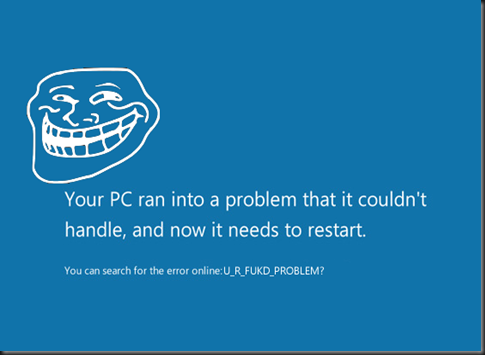
Remember this troll? This error is NO MORE in the Final release of Windows 8. Woohoo?
I had to deal with a few other stuff right after the final release was installed. Oh the irony…
As mentioned before, I prefer the old Windows Vista/7 Boot manager, instead of the more confusing graphical-styled one that comes by default under Windows ME-3. Nothing has changed. Still the same unesthetic bootscreen, with the same tedious procedure when you start another OS than Windows ME-3. Good thing is, you can use BCDEDIT.EXE to revert it to the old, faster text-mode one.
After a couple hours, tweaks and such, and going through a little tutorial (for touchscreens) on how to use Windows ME-3, I’m presented with my migrated user account, and upon logging in, with the already familiar, dreadful, confusing, mind-raping, “pull my hair out of desperation”-triggering Start screen:
image
Given it was an upgrade from the RP, all of my apps were still there. As you can see I decided to install some more shit as well, given the broader repertory in the RTM’s Windows Store. Some of the games include the classics: Minesweeper, Solitaire and other stuff. Some of the apps are nice freebies, but still, the Metro interface (now called “Modern UI”, “Windows 8 Style”, or as I call it “Shitty UI”) feels like quite a stepback. Like I mentioned before, it is like going back to Windows 3.x’s single-tasking days, with a much…blander look. Win+Tab key still works to switch between the apps, and surprisingly, Alt+F4 closes them, so I can save all the crazy gesturing shit I had to do in the RP (the hotkeys did not work for me at least in the RP).
Tried some other Shitty UI apps, such as Skype or IM+, and to my own dismay, the connectivity was stable… Yes… as stable as enrichened uranium. I kept being asked if I had connection problems and shit, but I doubt it is my connection or something, since the desktop version for Skype and Pidgin’s connectivity still worked like a charm (Edit: I just found out that is not actually a bug, but another shitty feature designed to "save power/CPU usage or stuff"). Plus, the Skype app would keep connecting without me noticing upon logging into my account. Haven’t found a way to stop it from doing so yet.
The Start screen… what can I say about it? It is so bloody hard to find stuff like the Control Panel (which I tend to access from My Computer, on the Ribbon), unless you use the Search feature. Microsoft, you’re doing it wrong. You’re doing it ALL wrong!
The desktop still looks –almost- the same, except for the now flat-looking, unappalling theme it has by default. Like I mentioned in the RP, the transparency of Aero Glass was removed (except for the taskbar) in favour of this:
http://images.dailytech.com/nimage/Win8_Metro_Desktop_WinUnleaked_1.PNG
Microsoft has dropped Aero completely, just because they told it was “old and cheesy”. Well, the flassy look in Windows Vista looked more modern than this thing, and it got improved in Windows 7. Man, I got so delighted when I first tried Windows 7, even since the RC, unlike Windows ME-3. Now, if you want something cheesy, well, you have the new cutting-edge, state of the art Windows ME-3 Theme.
Now, by testinf the classic desktop apps, most of them seem to work just fine, for now, but they tend to act up at times as well. For example: Skype itself. IT FUCKING FREEZES RANDOMLY. On the bright side, the new Task Manager comes in handy to kill the program without questioning anything.
Moving on from the software itself, here comes the ironic facts.
You might be asking… Why have I dubbed Windows 8 as “Windows ME-3”? Well, Windows Vista was the Windows ME-2, and Windows ME-3 is already being a failure. Analysts are already foreseeing Windows ME-3 as another disaster for Microsoft, making it comparable to Microsoft Bob. I’ve watched some of MS’s ads about Windows ME-3, in Mexican Spanish as well as in English, boasting the OS’s “user-friendly” interface. Now, I want you to do a little experiment to prove you how easy it is to use Windows ME-3:
Easy to use? Yeah, right… We’ll see about that!
You’re gonna need:
  • A computer with Windows 8 installed
  • Another computer (or a hard drive partition/virtual machine) with a previous Windows version. It could be from Windows 95 to Windows 7.
  • A user, preferrably familiar with Windows 7 or earlier, that hasn’t tried Windows 8 yet.
  • Mouse and keyboard or… *cough* even a tablet.
  • A camera would be preferred, but it is not required.
Now, sit your user, make him comfortable. First, sit in front of the earlier Windows desktop, and ask him to shut down the computer. No Power button or Alt+F4, but the Start menu.
Once he succeeds, ask him to do the same, but under Windows ME-3. Given you have some experience with the OS, you can explain them later the Shutdown is in the Charms menu, given they’ve gone all nuts pulling the hell out of their hair realizing the Start menu was no more or the Shutdown option was that hidden. Don’t forget to give him/her a prize for their patience! Risa a carcajadas
So yeah, here’s your user-friendly Windows ME-3.
Now, it is ironic. Microsoft has spent already billions of dollars in promoting their new OS hoping it would succeed as much as its predecessor. And their sales are way below those of Windows 7 at the same time after release.
The system has got mixed reviews already (yes, there are already Windows ME-3 fanboys bitching at how awesome the UI is), so don’t expect Windows ME-3 to sell as much, or especially outnumber Windows 7’s sales. You can say whatever you want, but this will be another failure in Microsoft’s history.
It is so their desperation that they are already giving pirates a chance to upgrade to a legitimate Windows 8 copy, Media Center and all. HOW IRONIC! Desternillado de risa
TrollBSOD.fw
So, what’s my opinion? Don’t upgrade to Windows ME-3. Stay with Windows 7. I advise not to stay with XP anymore, since it is now about to die, much to our dismay. If you’re too curious to experience Windows ME-3 yourself, do it on a VHD (Windows 7 Professional and up has this feature), a Virtual Machine (I recommend VirtualBox or VMWare Player. Don’t recommend Windows 7’s Virtual PC much for this OS), or in another partition. If you upgrade your Windows XP/Vista/7, you’ll so regret it later. Oh Microsoft, what have you done? You’re still on time to mend your ways, before Windows ME-3 spells from just “FAIL” to “BANKRUPTCY”. Listen to what your customers want. If we want the Start menu back, bring it back! IMHO, it was a terrible idea to merge two platforms (Desktop and Tablet) in one.

EDIT: Here's a little something I mashed up on a single bloody night:
 

Saturday, August 4, 2012

Windows 8: Is it worth it?

Well, I’m back now. But now I’m no longer gonna publish shit in Spanish. Why? Cause I say so. But as before, I’m here to rant about stuff. And now it’s time to give a review and of course rant against Microsoft’s latest version of their flagship product: MetrocalypseMicrosoft Windows 8.
windows-8-logo

This is Windows 8’s official, state-of-the-art logo. This appalling design was actually made by a designing company named Pentagram. Looks almost identical to Windows 1.0’s logo, so this could mean MS is going backwards.
windows8logo-fixed

At least Adobe Photoshop, GIMP or similar stuff exist to help with CERTAIN things.

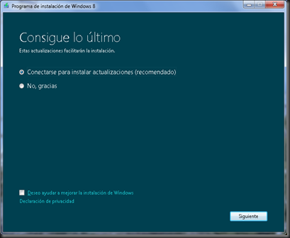
Now I have about a month trying, and getting used to this giant cell phone (that once was just a computer). The installation was not easy, and I really had a hard time, trying to figure out stuff. Like most curious people, I decided to download and burn a Windows 8 Release Preview ISO, and tried to install it. Upon installation, I found my first problem.
image

Wanna update? No, thanks.

image

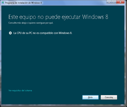
“Your CPU isn’t compatible with Metro’s shittiness” message, localized and all.

Okay… Let’s settle things up. I’ve got an eMachines L3067, with a Pentium D processor, each core running at 3.00 MHz, and my computer runs Windows Vista, Windows XP and Windows 7 in three different hard drives without any major issues. (and before installing 8, it had Ubuntu, then Linux Mint… I’ll miss you, Linux…). But when I tried to install Windows 8 from within Windows 7 (clean install, of course), I' would get an error telling me my CPU was not compatible. And how does Microsoft fucking expect Windows Vista and up users to upgrade? Thankfully, there are two workarounds. One is booting from the DVD (which I didn’t cause I wanted Windows 8 to have the same drive letters as XP, Vista and 7 have). The other is closing Autorun, and running the Installation file directly: (CD):\Sources\Setup.exe (where (CD) is your actual DVD-ROM unit, duh!)
image

…and that’s one error solved.

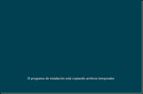
From here, the installation will work like the Windows Vista/7 setup process. The Setup program will ask you some stuff, like the Serial number, the partition, the kind of installation you want to make, etc etc etc.

If you please, you can go out to walk the dog or something while the installation…installs this thing. If you took a long while, this next screen is what you’ll see.

This screenshot’s not mine. Windows 8 RP’s version looks similar, although it has a few more choices.

And now… the last steps for completing your Windows 8 installation. “Pick the color you’d like”, says the Installation. This color will be used for your Windows logon screen.

Now, I committed another stupid mistake in here. I used my Hotmail account and made it my Windows 8 account, instead of making a local Windows XP/Vista/7-like traditional offline account. Thankfully I fixed that right after. Anyways, the last steps are not much of a big deal, and soon you’ll be presented with this…
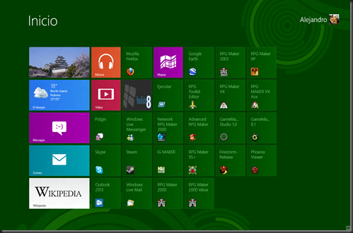
image

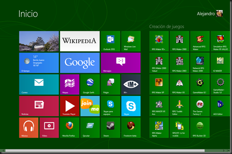
Yup. This aberration is the new Windows start…screen.

CONGRATULATIONS. You' have now installed Microsoft Cellphone OS for PCWindows 8, and the first thing you’ll see upon logging in is this new, unesthetic screen. Windows’s main Shell is no longer Explorer, but this thing. Those colored things are Metro applets, and yup, some classic Desktop apps as are there well. But… where’s the desktop, you ask? Yup, it’s now reduced to another Metro app, dropped in just for compatibility’s sake. The top-left tile in the Start screen.
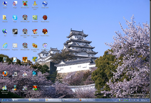
image

This is the part most Windows 8 users will be familiarized with: the Desktop. Here is where your classic apps run without major problem. Taskbar, desktop icons, systray, clock, and… hey, wait a minute…

image

WHERE IS THE START MENU?!?!?!

That’s easy to answer: there is no start Menu. Microsoft killed it in the Windows 8 CP in favour of the new shitty screen you saw earlier. Closest thing you can do is move your cursor to the lower left part of the screen (where the Start button was by default) to open the Metro start screen. And what about shutdown options? These can be found by moving the cursor along the right side of the screen, then clicking on “Settings” once the “Charm” panel appears, then “Shutdown”. Nothing too hard, but familiar users like me, who have been used to seeing the shutdown options on the Start Menu, will have quite a hard time trying to find it.

Yes, I know there are third party applications to emulate the start menu.I tried them all but didn’t really like either of them. 8Start opens a shrunken down Metro start menu, Classic Shell doesn’t really appeal to me as it doesn’t work 100% even like XP’s menu, and ViStart kind of breaks the taskbar, and I had a hard time removing the adware it came with. Hell, there’s even a method to use a toolbar as the new Start menu. Lamest thing ever. Now, the Release Preview still has Aero-like windows, but Microsoft has killed that too in the RTM. Not a big fan of Aero myself, but its effect especially under Windows 7 is nice. Looks better than Metro.

This is one of the shittiest points in this new OS. Now, let’s move onto some interesting feature: the Windows Explorer.
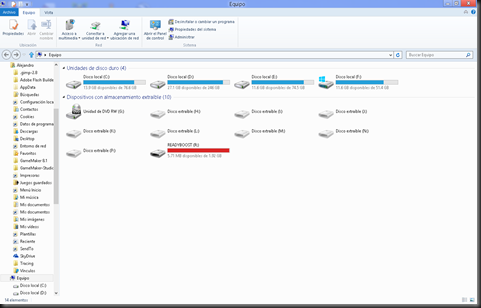
image

This is one of the few new features that I really liked; the Ribbon has finally been incorporated into the Windows Explorer UI. At first, when it was introduced in Office 2007, I loathed, criticized and refused to use this UI, but found out it was way easier to find stuff in it rather than the old tabs in Office 2003 and downwards. And its appearance in Office 2010, Windows Live Essentials 2011 and Windows 7’s WordPad and Paint (still present in Windows 8), was redesigned, offering a much better look. Took me a bit to find the Folder options though, which was now present under the “View” tab, as the “Options”…option.

Installed a few software, including Office 2013 Preview (which will be reviewed at a later point), and decided to perform a restart. And found this:


Again…not my screenshot, but it looked rather similar. “Windows 8”, “WIndows 7”, “Windows Vista”, and “Previous Windows Version” (XP) were the four choices I had available.

I have always wanted to see a GUI boot loader, and this is now possible, even with a cursor and fade in/out effects, but this bootloader still seems to require lots of work.

  • It takes a lot longer to load, way more than Windows 7/XP’s loaders cause of obvious reasons. The bootloader runs on Windows 8 too.
  • It is visually…unappealing. There should be at least an icon representing each operating system, not those dull-looking windows. Hopefully that’s been worked on the RTM.
  • It’s process of loading other OS than Windows 8 is kind of confusing… First time I tried booting onto Vista or 7 I tried to perform a repair install to find out what was wrong with my OSes… After I found out how does this work: After you select another OS than Windows 8, the bootloader restarts the computer and starts directly that OS… much more complex than the good old text-mode boot manager. Don’t remember how did I do, but I managed to restore Windows Vista/7’s boot loader, and it loads Windows 8 rather well.
  • It is Metro-powered. At this point I’m getting rather sick of even hearing the word.
  • That blue makes me feel…blue.

Anyway… it’s time to check out the…Metro… apps.

Windows 8 RP had a few ones preinstalled, including Messaging, Mail, Contacts, Calendar, Store, Music, Video, Maps (the earlier ones aimed to replace Live Essentials). I have downloaded some additional stuff from the Store as well. And all of them work fine with the “Charm” menu (the one that pops when you move your cursor right). Once again, while most Metro apps look nice and all, navigating through them is kind of difficult. It kind of feels like going back to Windows 3.1’s songle-tasking days. But, here are a few tips to help you help me help us all:

  • If you have more than one Metro app (including the Desktop) you can move your cursor to the upper or lower left (lower will always display a thumbnail of the Start screen) and see all the stuff you have open. To close an app, right-click on its thumbnail and select ‘Close’.
  • The Windows+tab combination will display this sidebar as well, and will allow you to switch between all the Metro apps you’ve got open, including the Start screen and the Desktop (same thing that Alt+tab does on the Desktop). Aero Flip was removed, so they decided to assign this key combination to that stuff instead.
     
  • And there’s the Snap multi-tasking. Since I suck at explaining, I’ll quote PC Advisor instead:

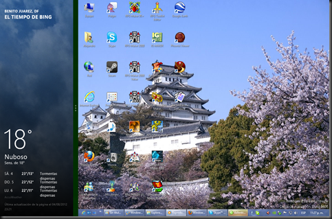
When working full-screen, you'll need to put the cursor in the top left of the screen and then pull down (without pressing any mouse buttons) to reveal thumbnails of all your opened programs. Now left-click and grab the application you want, dragging it away from the other thumbnails. Drop it into the smaller space (if you drop it into the larger space it will simply take up the full screen).
image

This screenshot is MINE. Anyways, although you can do this and multitask between even 2 Metro apps, I find it really uncomfortable especially if one of them is my Desktop.

It’s not really a bad OS itself, and it would be perfect for tablets, to which it is especially aimed. But Microsoft is shoving this UI down desktop users’ throats as well, and it has received negative reviews cause of that. Including me, not everyone is happy with the removal of the old Start menu and its replacement with the Metro Start screen. Gabe Newell, CEO of Valve has branded it as a catastrophe for everyone in the PC space, driving Valve to embrace Linux and cancel HL2 Episode 3. An analyst firm named Gartner has chosen just a simple word to describe Windows 8: bad. Troy Wolverton of phys.org has branded the OS as a major misstep for Microsoft, especially for PC users. And the reviews go on, some of them positive as well.

My conclusion goes among these as well. Windows 8’s Metro UI is unesthetic, ugly and hard to comprehend, even with the few improvements it has got. The OS gets to freeze sometimes. From my humble point of view, Windows 8 might be the Windows ME 3 (with Vista being the Windows ME 2). Let’s all remember how badly reviewed Vista and ME were. I see bankrupt in Microsoft’s future… For now, I’ll try to find a way to adapt a Telcel SIM card into my giant new cell phone, lol.

Windows_ME_Logo

It’s like a curse…

windows-ME2-logo

They do it every 2 releases it seems…
windows-ME3-logo

Oh well… some people won’t learn.

TrollBSOD.fw