How do I start?
I recently got an Acer Aspire One 756 netbook, and I must say I love the computer. It is nice, slim, elegant, it it was quite a nice choice. A pretty good performance for a netbook. But I had a problem with it: Windows 8 aka Windows ME 3.
Despite being familiarized with the latest OS from Microsoft, which boots on my desktop besides Windows XP through 7, I had quite a hard time the first times I tried to handle Windows 8 on my new computer, ironically. As far as I know, this model was originally powered by Windows 7 Home Premium (another highlight, since most netbooks had Windows Starter), and they decided at some point begin shipping them with ME 3. And thus, mine came pre-loaded with Windows 8. Now, I’m not willing to wipe out the HDD and install 7 from scratch, as it would involve turning UEFI off, and looking up for the OEM shit from Acer’s website, which would take me quite some time. I felt like pulling my hair, since Windows 8, if hard to use with keyboard and mouse, was a harder experience using a touchpad.
Okay, so you’ve probably read my two previous short critics regarding Windows 8, Release Preview and RTM versions respectively. Microsoft would not hear its customers, and thus, decided to keep their latest OS hard to use for newbies and us veterans alike. Basic functions such as Shutdown have been hidden, given the Start menu is no more, and it takes a good while to discover the “Charms” menu and how to summon it (where the Shutdown is found now).
The lack of the Start menu is one of the things I bemoan the most about this OS, plus the “Modern-UI” apps, which make me feel like going back in time to Windows 3.11’s single-tasking days. So, now we will be examining a few options to cope with this loss, until Microsoft realizes their mistake and bring the Start menu back in. That is, if they ever get into reason and decide to do so…
Coming up next, I will present some of the most popular programs and tweaks out there, and what I personally think of them. Some of them might help making Windows 8 a bit easier to handle while others… hahaha…
1. Create a “Start Menu” Toolbar
Instructions copy-pasted from How-To-Geek:
It’s not a well-known feature, but Windows can create toolbars that show the contents of a folder on its taskbar. This means that you can create a pseudo-Start menu without installing any other software on Windows 8. Just create a new toolbar that points at the Start menu’s Programs folder.
From the desktop, right-click the taskbar, point to Toolbars and select “New toolbar.”
Type or copy and paste the following path into the Choose a folder window:
%ProgramData%\Microsoft\Windows\Start Menu\Programs
Click the “Select Folder” button and you’ll get a Programs menu on your taskbar.
Laaaaame…
Right-click the taskbar and uncheck “Lock the taskbar” if you want to move the new Programs menu around.
Drag and drop the grip at the left side of the toolbar to place it somewhere else on the taskbar, like at its left side — the Start menu’s traditional location.This workaround is even more stupid than Windows 8’s start screen.
Right-click the “Programs” text if you want to change or hide its name. After you’re finished, right-click the taskbar again and select “Lock the taskbar.”
There’s one catch with this method — it won’t actually show all your programs. The Start menu actually grabs shortcuts from two different places. In addition to the system-wide ProgramData location, there’s a per-user Programs folder at the following location:
%AppData%\Microsoft\Windows\Start Menu\Programs
As you can see from the screenshots, the Windows Defender shortcut — and other shortcuts — don’t appear in our toolbar menu.
You could create a second toolbar to list programs from this folder, or perhaps move shortcuts from the %AppData% location to the %ProgramData% location.
Another option is creating a custom folder full of program shortcuts and using a toolbar that points at that folder instead.Do I recommend it? No
Pros: None.
Cons: This method is not even a Start menu. While these kinds of toolbars might be useful in some cases (ie, bringing back the Quick Launch for those who prefer it, or another custom launch toolbar) it is about the stupidest workaround I’ve ever seen. I find it as useful as getting to use a 5.25 inch floppy disk on a modern computer. And note that I highlighted… “it won’t actually show all your programs”. That’s right. If you want to access all of your Start menu items, you’d have to either move everything into a folder (since Start menu uses two, a system-wide and a per-user folder) or creating two damn toolbars. Whoever thought of this, should be impaled. Ugh…
2. LeeSoft’s ViStart
“ViStart” is a pun on “Windows Vista” and “Start”, and likely it would mean “Vista’s Start menu”.
As we can see, this looks more like a Windows 7’s start menu, unlike the first method we showed. Since I reviewed it on Windows 8 RP (where it would break the taskbar), it has got a few improvements. But meh.
Do I recommend it? No
Pros: It is a decent implementation of the Windows start menu.
Cons: It cannot be customized, besides the ability to turn “Metro” on/off. Every time it starts, it shows a splash screen and a systray icon, which gets to be annoying especially if you set it to start upon computer startup. The Start orb comes cut off. Also, it comes with potential adware and unwanted toolbars bundled.
3. Classic Shell/Win8 StartButton
Here’s an open-source implementation of the Start menu, which has more customization options. It can emulate a Classic Windows 9x, XP, Vista or 7-like menu, but sadly, it is not as accurate.

Now what about Win8 StartButton? It’s the same software, nothing new or relevant. Just a rebranded fork of Classic Shell.
Do I recommend it? Maybe
Pros: It is open-source (or so I take it as the downloads are from SourceForge). It is way more customizable than ViStart, giving you the ability to configure from the Start items, to the menu’s look itself, including skin, button, etc…
Cons: If you are looking for a Start menu that looks as accurate even as Windows 9x, forget about Classic Shell, as this is not the software for you. That’s why Classic Shell does not appeal to me in the slightest.
4. Start Menu 7 (aka StartMenuX)
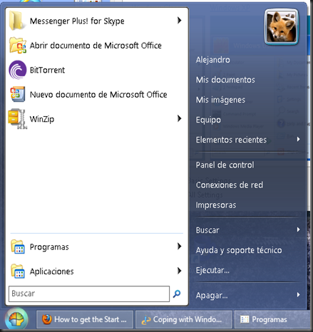
Well, one picture is worth more than 1,000 words…
This was one of the strangest implementations I’ve seen. It has a neat appearance and all, but again, not something that appealed me that much. I actually found it hard to navigate through it. Folders don’t open submenus. Instead, they open an Explorer window. At least, it happened that way with me. Also, what’s with the strange language? That’s not even Spanish.
Like the author said…
Welcome to Start Menu 7 - the best software to replace the standard Windows Start Menu ever made. Before creating Start Menu 7 program, I've spent a lot of time to understand how a human brain works with visual information. That's why Start Menu 7 is so easy and natural to use for everybody.
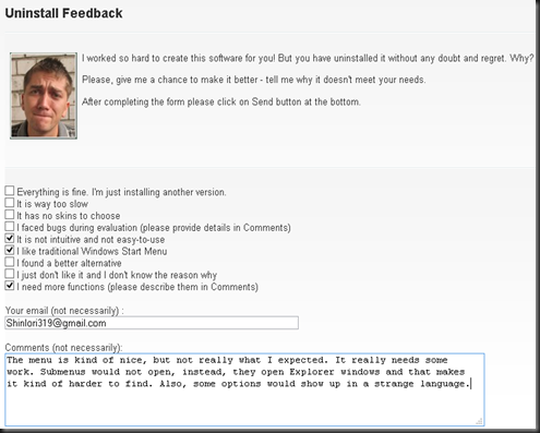
Well, the idea is nice and clever, but it still needs lots of work to have at least half the functionality a traditional Start menu has. Also, upon uninstalling it, my browser opened with the following website:
Haha, I am pretty sure the text and the picture of the creator with puppy eyes is intended to create remorse on whoever uninstalls his software. But yeah, I sent my feedback. Hopefully the author will not drop it into a broken sack like some companies do with their customers. But for now, I don’t recommend using it. So…
Do I recommend it? No.
Pros: Well, it’s…different
Cons: No submenus implemented, also looks like there’s a “Pro” version. I don’t know what it has, but still. If you’re using a non-English version, it will likely show some options in a strange European language.
5. Pokki
Another strange implementation with its own apps as well. What can I say?
Do I recommend it? Maybe
Pros: It comes with an elegant look, plus it has its own apps and stuff, which you can get from the Pokki App Store.
Cons: Again, if you want an accurate Start menu, this is not the software for you.
6. Stardock’s Start8
Well, last, but not least. This was one of the programs I examined back in the Release preview, by then avoiding since it had only a miniature Metro start menu. The final version has more than just that. Just take a look by yourself.
Okay, that looks more like a Start menu I’d love to use. Actually, Stardock has done quite a good job, and honestly this is the best implementation out there. Even the button itself, it looks as I think it would look of MS still thought rationally. One downside I found was upon trying to use it under Aero Lite, which would actually trigger the transparency glitch on the taskbar (“Aero Broken” or “Aero Glitch”).
Do I recommend it? Yes
Pros: It is the most accurate implementation of the Windows 7 Start menu, comes with different skins and buttons as well as options to customize the menu’s contents.
Cons: It is actually not free. While it is cheap ($5), I am not willing to spend any money on core OS functionality. Seriously, Stardock. Why do you have to make money out of something that most of us see like a core component of the OS? It woulda been a better idea if you asked for, I don’t know, donations to support this masterpiece! There is a patch out there, made by someone named “Painter".
So, there you go! Here are some of the most prominent programs out there to return a core component that Microsoft took away from us. If you have a suggestion, you can say so in the comments, or by e-mailing me at ShinIori319@gmail.com, or alejandro.tellez319@hotmail.com.
And last, but not least, I don’t have much to say but to wish you a painful apocalypsemerry Christmas and a happy end of the worldnew year!


No comments:
Post a Comment